Design Quickie: Paper Donut

I joined two of my colleagues on this ridiculous journey dubbed “75HARD”.

Sparing you the boredom, 75HARD is 75 days of torture you inflict upon yourself via supposed health and wellness. And it’s HARD. You can immerse yourself in the details here. Parts of it are easy—I can read 10 pages of a book no problem. I love reading. (Currently taking in Debbie Millman’s How to Think Like a Great Graphic Designer.) Taking the progress pic? Sure, I can do that. But the things that get me are the gallon of water and the exercise 2x a day for 45 minutes each, with one being outside regardless of weather conditions. I’m good for once a day, but twice? You’re asking for a lot, timewise. While I can certainly make time for it, my body has other plans and bed time is 100% between 8-9pm, especially Mondays and Tuesdays when the following mornings beg me to get up at 5:30 am to be on the road an hour later to ensure I get to work at least on time. The outdoor part, in general, is easy to do because it’s getting warmer out, but it’s also been raining a lot. It even snowed the other day for a literal 3m45s. I’m not a stranger for jogging in the rain, either (just ask my clients from Stallion Marketing—I showed up to their house one time, drenched, because I decided I would go for a jog down the island)… I dunno. It seems to be a bit much to ask me to do Pilates out in a tornado.

Anyway, I told myself I should avoid traditional snacks during these 75 annoying days of Hell just to say I did it and can do it. What does my body do? It collaborates with my brain to make me think about donuts 24/7.

I needed to satiate the craving, so this morning I sat down and started playing with some of Illustrator’s 3D tools to build a donut.

I wanted a donut, so I made a donut. A paper donut—cardboard cake, paper frosting, and illustrated jimmies.

While I have a lot to learn with these tools, I found it interesting. Adobe has come a long way with the 3D tool feature in Illustrator. I remember when it was first introduced, it was BAD. Like…I would use it at work for quick signage renderings because they were small enough that I could get away with it and no one would know the difference. If anything, my non-designer colleagues would throw their hands up and shout, “Perfect!” and send it off to the client.

My favorite part of this is the integration of textures. The textures, from what I saw, are pre-set, but they’re actually really nice.

For the cake part of the donut, I wanted something donut-y. Sand was too rough, and the copper was too metallic. I saw a cardboard option and really liked the way it looked. For the frosting, I couldn’t figure out how to map the art onto the donut, so it became a die-cut piece of hand-made paper with too much Elmer’s School Glue (dries clear!) using some sort of paint or concrete texture. It looks a lot like papier maché, so it worked out.

The jimmies are a lost cause for now.

What I like about this look is it reminds me of crafts you would do as a kid with paper towel and toilet paper rolls. It’s got that same childish, school-made-project-for-some-dumb-holiday feel to it, but almost a little nicer. All it needs is my signature in a poorly sharpened, probably flat Crayola crayon that’s been broken and half and somehow melted on one side, covered in bits of snot and playground mulch from the kid who thinks washing his hands will peel off his skin.

It’s a red crayon, by the way.

I think I’m going to explore the 3D tool more. As for the frosting, I believe that is going to have to be a handmade venture using meshes, various steps of color for shadow and light, and a handful of artistic exaggeration somewhere in the process.•

Design Quickie: What Thit HEO?! (Sticker)

EDIT: Stickers are now available for purchase!

I grew up in a bilingual household. My mom is originally from Vietnam and speaks, well, Vietnamese. My (late) dad was born and raised in Philly and spoke Philadelphese—you know, stoop, crick, wooder, hoagie. All dem jawns.

On my mom’s side, all of the ladies speak with poise. Their English may not be that great, but they try and I can understand each of them quite well. The men, on the other hand, also try, but they try hard. So hard, in fact, they also learned to speak Philadelphese…ish.

This sticker design, which makes me laugh heartily every time I say it aloud, is an homage to my Vietnamese uncles and any other AZN bad boy who always lets one slip when the time’s right: WHA THIT HEO?!

So, unless you’re familiar with what any sort of Asian accent sounds like (I’m really nodding my head at Vietnamese and Chinese), then these words won’t make sense.

I’ll break it down:

• Wha = what

• Thit = the/tha (if you also speak Philadelphese) (FUN FACT: “thit” as a Vietnamese word means “meat”.)

• Heo = H-E-double-hockey-sticks, hell

what•thit•HEO?!

Design Quickie: Make it POP!

EDIT: Stickers are now available for purchase!

A running joke between creatives is how clients, who are not well-versed in designer vernacular, will often try to overdescribe what they want as compensation for not knowing how.

Other times, they’ll use power or action words in lieu of what we would use.

The most popular is, “Make it POP!”, sometimes phrased as a question, “Can you make it pop?”

To celebrate this, I made a sticker design for today’s design quickie.

The one on the left was my first draft, but to simplify it and make it a little easier on the eyes, I turned it into the one on the right. Both are annoying, just not equally. Trying to decide if I’ll turn this into a sticker. (You’ll be the first ones to know when and if I do.)

MakeitPOP

Design Quickies - Gotta Go Fast!

TallerGirl-01.jpg
f7b2e883523213.5d3f4a7acd06b.jpg

Over the summer, I needed a creative kickstart. I felt like my portfolio was lacking and I was the only one who could do anything about it…but what?

So that’s when I got this idea—what if I, before I started my work day each morning, got on the computer and just opened a program, picked a skill to refine and spend 1-2 hours working on a quick project. I dubbed these “Design Quickies”.

These Design Quickies, or DQs for short, had three jobs: keep myself in practice or learn how to do something new, build up my portfolio, and keep my creative juices flowing. My job, at the time of this conception, allowed me more creative release than the last, but was not nearly enough to keep me happy as a designer.

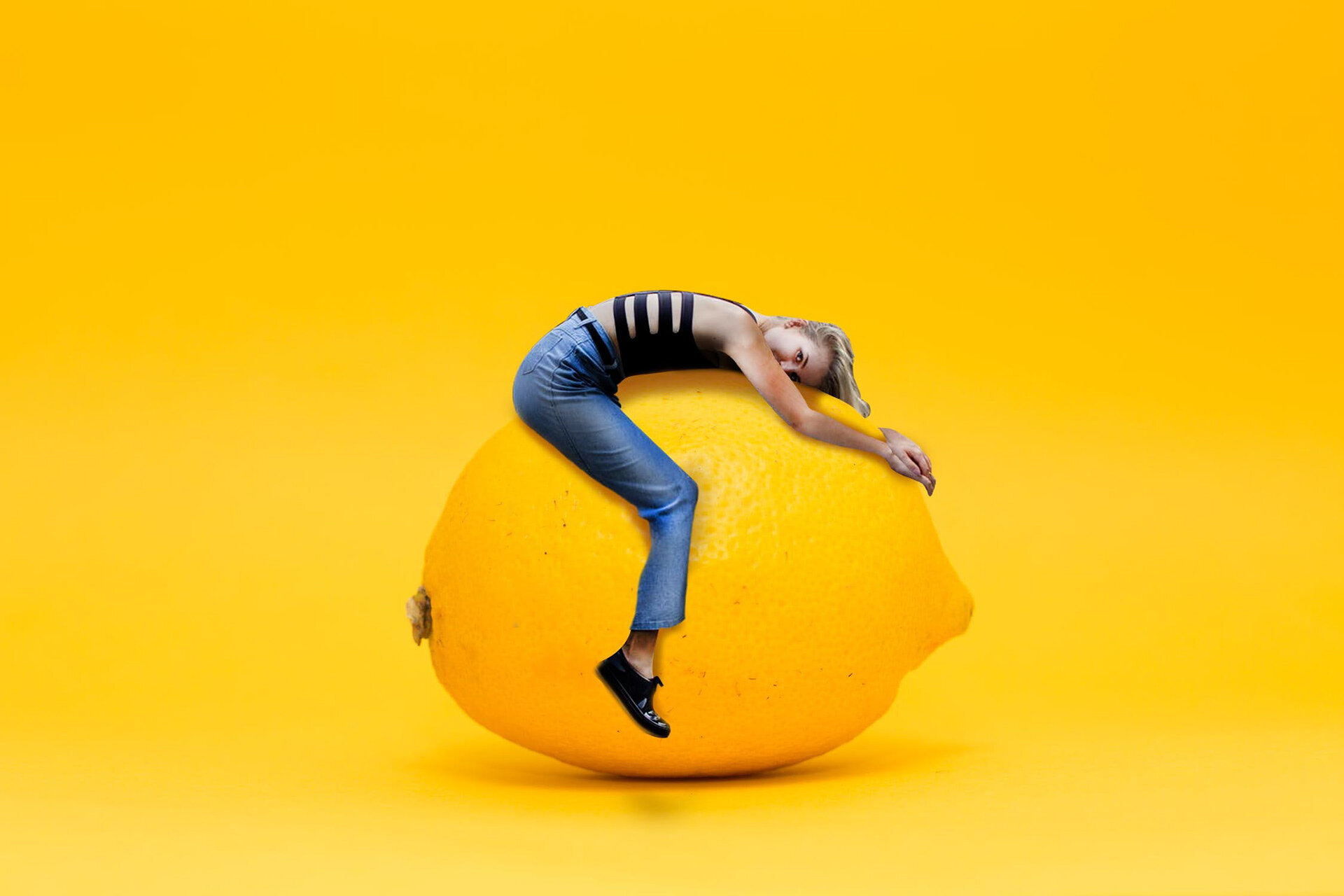
I kept up with this for a little while, trying to add humor to my work. I experimented with size and scale (as shown in the two examples on the left), type treatment, color, and ideas. Each session, I’d do a web search for random things that popped into my head, gather the items I’d need and go to town. The only rule was each DQ could only be worked on during that session. Once the session was over, I would never touch the piece again.

Needless to say, a few pieces remain unfinished, like the family portrait I took form my personal photo library and attempted to replace everyone’s face, including my own, with Gary Busey’s.

I’ll pick DQs back up soon, as I have a few things I want to try out. They’ll be shared in the blog in the future and will possibly earn a spot in the portfolio if they really rock my socks.