ADA Signage - Learning and Applying Knowledge and Skills

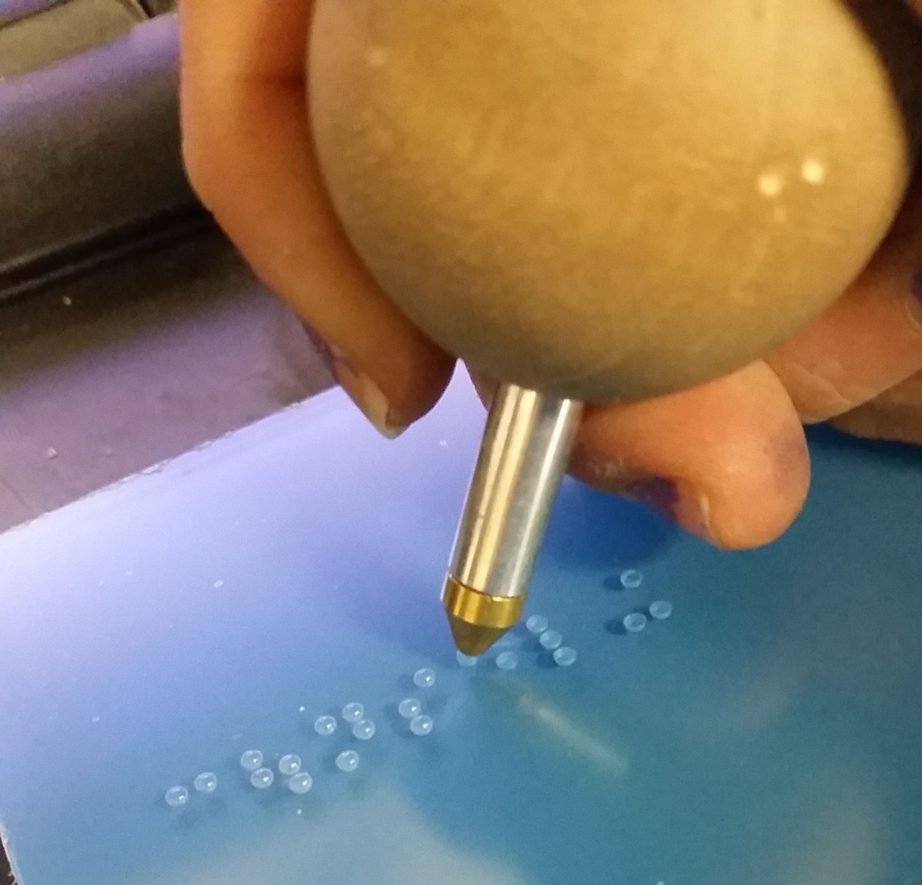
Photo credit: Myself—I used my Samsung Galaxy S3 to photograph my own hand manually inserting braille rasters into holes drilled by machine into a 1/4” thick piece of P95 acrylic.

Photo credit: Myself—I used my Samsung Galaxy S3 to photograph my own hand manually inserting braille rasters into holes drilled by machine into a 1/4” thick piece of P95 acrylic.

When I took the job at Urban Sign in September of 2013, I was very much under the impression that I would be just their in-house graphic designer. What unfolded during the five years I was employed there was much more than pushing around pixels on the screen.

I started to learn more and with each new thing I learned, I was also given new responsibilities and eventually I was able to run production by myself. One of the subjects I had to learn about (and more or less teach myself) was interior ADA: how to design it, how to make it and how to install it.

So what goes into a standard ADA sign for, say, a restroom? More than you think!

It starts with the verbiage. What does the sign need to say? Bathroom? Ladies? Restroom? From there, a layout is designed. Restroom (or any other) signs can be any shape or size, so as long as your isotype (icons) sit in a space that is a minimum of 6” tall (no minimum height for the isotype themselves), your copy is no smaller than ⅝” high but smaller than 2”, the space between your copy and braille, and around the braille is no more or less than ⅜”, the braille rasters protrude from the sign no more or less than 1/32” and are domed, and the colors on the sign are contrasting enough that anyone from any distance can tell them apart. Oh, and the braille on the sign MUST follow the copy and be grade 2.

Did I lose you yet?

The aforementioned specs are not guidelines, but rather lawful standards written in the ADA (American Disabilities Act) manual of design standards. Although it’s rare for someone from ADA to walk into your establishment and whip out a ruler to measure your braille, if you’re found to be in violation of ADA code, you face up to $75,000 for your first offense, with each following offense looking at $150,000 a pop. So before you send out that ADA sign for install, make sure it follows all the proper code.

A sign I laid out and assembled for a space at Drexel University. This sign was fabricated out of bent aluminum, 1/32” thick non-glare acrylic material, clear raster braille and screen printed copy.

A sign I laid out and assembled for a space at Drexel University. This sign was fabricated out of bent aluminum, 1/32” thick non-glare acrylic material, clear raster braille and screen printed copy.

I was HORRIFIED when I moved on to my next job at drive21 and, while poking through previous job folders on their drive, found that more than half of the jobs they worked on had violations all over the ADA signage. Most of them having come from design firms or the clients themselves and no one on staff knowing any better to correct any of it. I made it my own personal mission to make sure that future jobs would not suffer so as long as I could help it. The folks I worked with closely at Cadwell Signs up in Holliston, MA, during my time at drive, dubbed me the ADA Kween because I was able to have conversations about what we were working on, not just listen and agree. I was able to teach one of the designers what I knew about ADA and on every call after that, I was greeted with “The Kween as arrived.”

A sign I made from photopolymer. Photopolymer allows you to process signs with all raised elements (isotype, copy and braille) at the same time. The entire sign is painted its base color, which in this photo is a charcoal gray, and the isotype and c…

A sign I made from photopolymer. Photopolymer allows you to process signs with all raised elements (isotype, copy and braille) at the same time. The entire sign is painted its base color, which in this photo is a charcoal gray, and the isotype and copy are tipped (sometimes hot stamped) the contrasting color, which here is white.

I’m not an expert. In fact, there’s SO much to know, learn, understand and apply that I could still take a 101 course and learn 2x more than what I already know. Each city, state and country, even, has their own proprietary set of laws (code) that govern how ADA is to be manufactured. California is notorious for stricter laws and codes on everything, so I wish drive the best of luck when they finally make their west coast expansion next year.

The craziness of it all is how fine some of the details are and how serious some places are with…well…everything. From the materials (do you want to use Nova or Jet?), to the cost (what do you want to spend?), to what it needs to look like (does it need to be photoluminescent? Are you using acrylic? Will you dome the braille by hand or rely on paint coats?) to methods of production (are you using the Raster® Braille method or will the braille be left behind in washout?), there are always a HUNDRED AND ONE questions to ask when making these signs.

I could go on with this post, but as I noted before, there is SO much information when it comes to ADA, that it’s impossible to keep it all contained in one blog post. But if you want to read some serious stuff on ADA, visit the ADA.gov website.
Butterfly Bridal Package

One of my best friends got married in 2018 and because she was on a super tight budget, I did what I could to help her DIY everything.

As her maid of honor, my job was to be her right hand man (woman?) in everything she wanted—dresses, expos, decorations, invites, etc. So, I did just that—we started with save the dates (pictured), then I worked on the bridal shower invites with the other bridesmaids, then came table decorations for the guest tables and signs for the prop tables.

The easiest part about all of this was the access I had to the equipment that would make my life easier: a laser cutter, wide format printers, jump shears, paper guillotines, vinyl for stickers, etc. I could use all of these for free and whenever I wanted!

Unfortunately, I didn’t get photos of everything, but the package was color themed: black, white, purple, pink and silver. We used butterflies (her favorite), flourishes, script fonts (whomever designed Autumn in November—thank you), and other delicate elements.

The full package included: save-the-dates, invitation set (main invite, RSVP, directions), envelopes (purchased!), script table numbers cut from 1/4” scrap acrylic on the laser cutter and painted with silver glitter spray paint, informative signs for guest photos on social media made with scrap Dibond, black vinyl and silver glitter spray paint, the bridal shower invites (shh, those were a surprise!), and Cricut-cut seating cards.

The wedding was a success and with all of the tangible elements being hand-made, it all had a personal touch. It was super fun making everything and I would 100% do it again if I still had access to the right equipment.

Design Quickies - Gotta Go Fast!

TallerGirl-01.jpg
f7b2e883523213.5d3f4a7acd06b.jpg

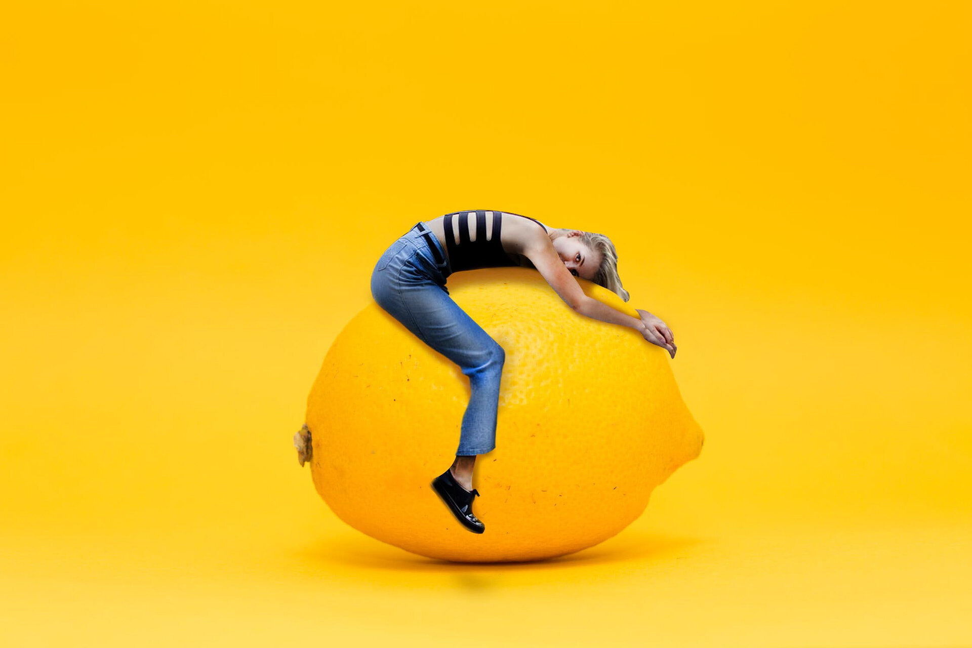
Over the summer, I needed a creative kickstart. I felt like my portfolio was lacking and I was the only one who could do anything about it…but what?

So that’s when I got this idea—what if I, before I started my work day each morning, got on the computer and just opened a program, picked a skill to refine and spend 1-2 hours working on a quick project. I dubbed these “Design Quickies”.

These Design Quickies, or DQs for short, had three jobs: keep myself in practice or learn how to do something new, build up my portfolio, and keep my creative juices flowing. My job, at the time of this conception, allowed me more creative release than the last, but was not nearly enough to keep me happy as a designer.

I kept up with this for a little while, trying to add humor to my work. I experimented with size and scale (as shown in the two examples on the left), type treatment, color, and ideas. Each session, I’d do a web search for random things that popped into my head, gather the items I’d need and go to town. The only rule was each DQ could only be worked on during that session. Once the session was over, I would never touch the piece again.

Needless to say, a few pieces remain unfinished, like the family portrait I took form my personal photo library and attempted to replace everyone’s face, including my own, with Gary Busey’s.

I’ll pick DQs back up soon, as I have a few things I want to try out. They’ll be shared in the blog in the future and will possibly earn a spot in the portfolio if they really rock my socks.

Sunflower Wedding

Invite1_REV1-01.jpg
58421139923__49F5BDBC-C03C-4C04-8512-3E36B5D07C0A.JPG
IMG_9501.JPG
IMG_9504.JPG

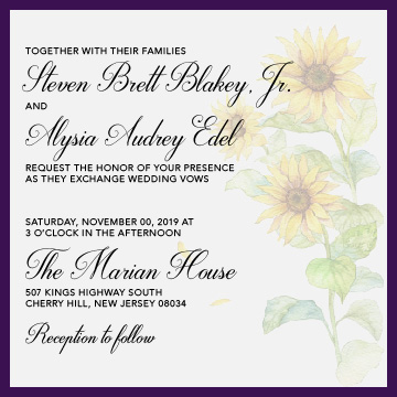
One of my best friends’ sisters was getting married and naturally, I was on the top of the list for people to get invitations from.

It started with a casual mention over lunch, to me emailing a questionnaire to the bride-to-be asking about colors, themes, dates, etc.

What I got to work with: purple, white, gray and sunflowers.

Because the bride lives in Florida, all of this was done through email and text: choosing the paper, designing the concepts, the fleshing out, the final layout, the progress updates and photos of the finished product.

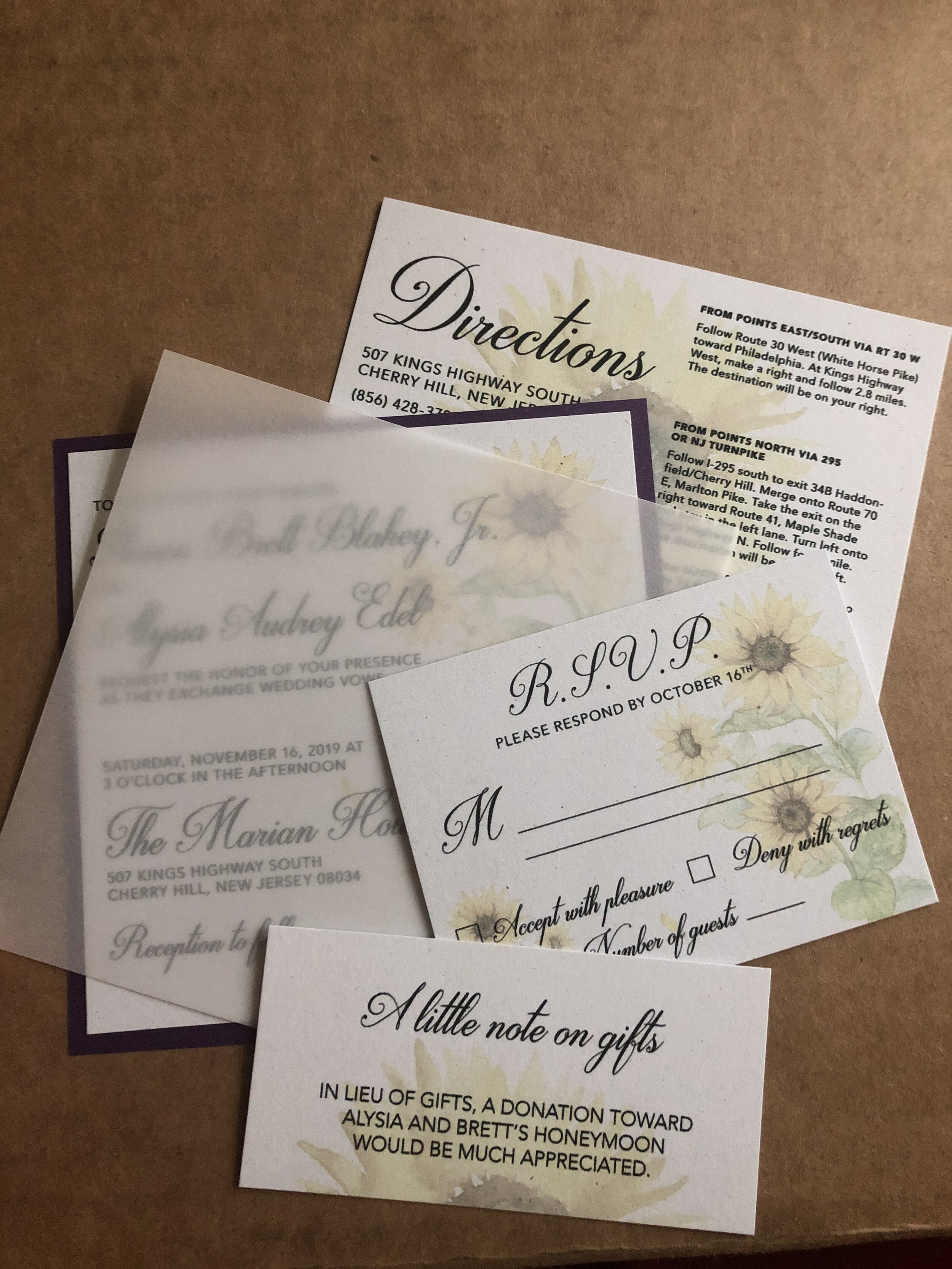
The layout design was done on the computer and I handed off printing to a friend of mine who has access to a large format flatbed printer. Ten sheets of 26” x 40” paper from Mohawk, dozens of sheets of purple shimmer paper and vellum from The Paper Store, several hours spent with a 15” guillotine and a basic X-Acto, going blind in low light, double-stick paper craft tape, some letratac, and it all came together.

The package consisted of save the dates (not pictured), main invites, vellum cover sheets, directions, RSVP cards, and gift notes—envelopes were the bride’s responsibility in this case.

This was probably one of my favorite hand-crafted projects and I look forward to taking on more just like this. The bride was super easy to work with and I hope her wedding planning is going just as smoothly. I’m also looking forward to attending the wedding to see how everything turns out!

Wine Bar

TreeTavern-WineBar-01.png

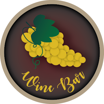
While working at the sign shop, I met a woman who was an important part of the company, although she was not an employee, manager or co-owner. Rather, she was a family friend who helped with the finance stuff and would occasionally bring the shop some work.

One of the projects she brought along was for us to build a custom over-the-door sign for the wine bar in a restaurant owned by a friend of hers.

She spoke with my boss, then came to me with her idea, giving me full rights to creativity. This is what I came up with, approval soon following.

The idea was to take the top portion of a barrel (imagine taking a large wine barrel and cutting just below the top band) and turning it into a custom sign with 3-D elements such as laser- and router-cut and painted acrylic letters and shapes affixed to the surface with studs and adhesive.

Unfortunately, the plan fell through, so we were never able to bring this sign to life. It sits memorialized in its 2-D state in my portfolio.

.

This was designed while I was employed at Urban Sign & Crane, Inc.