Poster: Red Robin (YUM!)

Project: Serif Vs. Sans Serif Effectiveness in Advertising
Type: School Project
Class: ADV5503 Persuasion and the Marketplace
Photos: Google search

Two posters designed for an experiment to determine whether serif or sans serif typefaces are more efficient and effective in eliciting positive emotions in print advertisements. The subject of these posters is one of four; only two were present in the experiment. This was not one of the four.

Each set of posters were set in both serif and sans serif type (one family each) with varying weights.
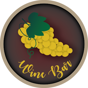
Wine Bar

TreeTavern-WineBar-01.png

While working at the sign shop, I met a woman who was an important part of the company, although she was not an employee, manager or co-owner. Rather, she was a family friend who helped with the finance stuff and would occasionally bring the shop some work.

One of the projects she brought along was for us to build a custom over-the-door sign for the wine bar in a restaurant owned by a friend of hers.

She spoke with my boss, then came to me with her idea, giving me full rights to creativity. This is what I came up with, approval soon following.

The idea was to take the top portion of a barrel (imagine taking a large wine barrel and cutting just below the top band) and turning it into a custom sign with 3-D elements such as laser- and router-cut and painted acrylic letters and shapes affixed to the surface with studs and adhesive.

Unfortunately, the plan fell through, so we were never able to bring this sign to life. It sits memorialized in its 2-D state in my portfolio.

.

This was designed while I was employed at Urban Sign & Crane, Inc.