EGD: Lash Paradise Beauty Lounge

Although I don’t wildly spend money on things I can’t afford, I’d like to say I have expensive taste. I enjoy looking at clothes, buying prestige brands when I shop for makeup, and not settling for store brand things when I know I can get the national brand names. I’m not great at saving (though I try), and I dunno… I wanna be fancy, I guess.

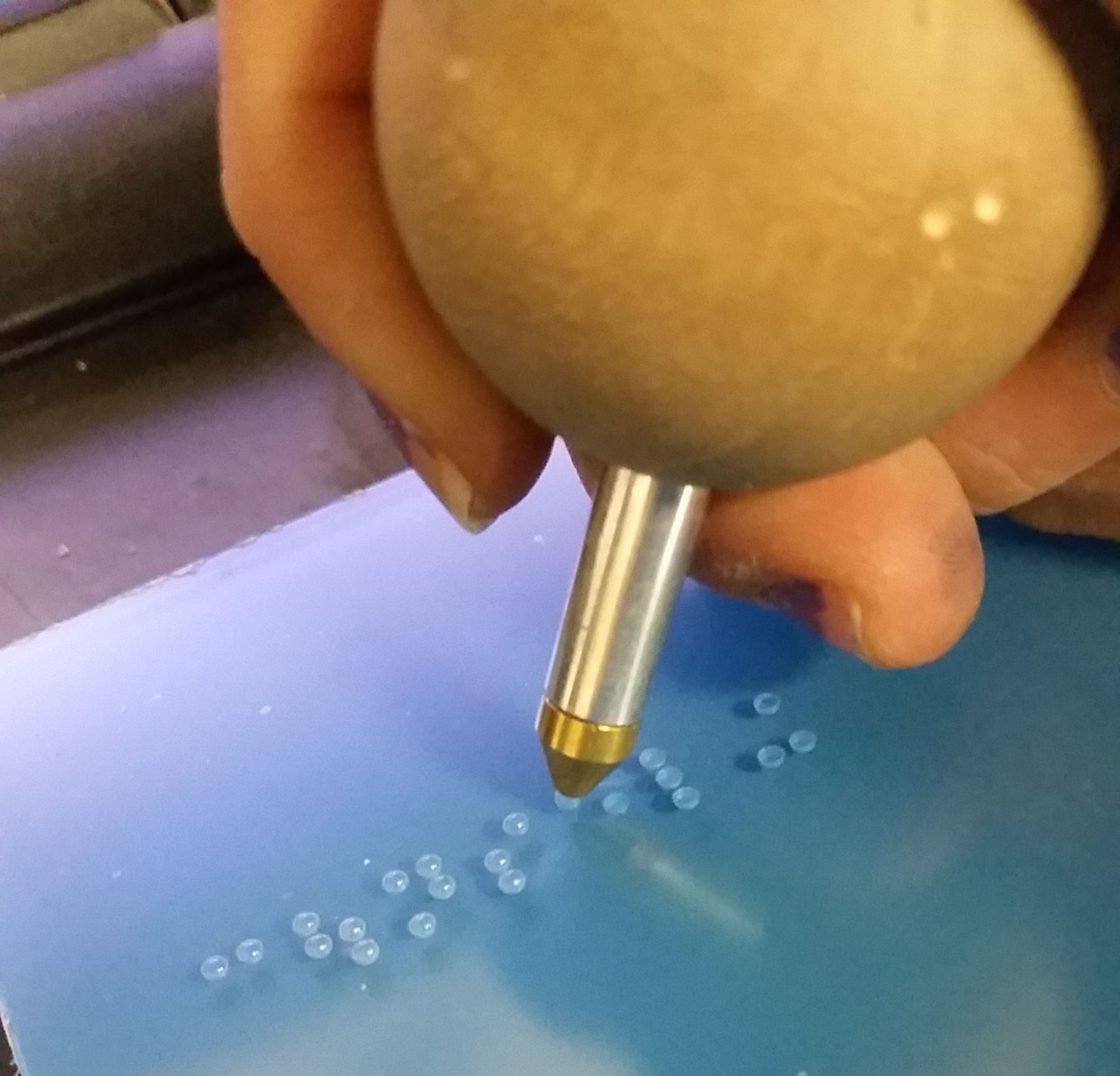
My boyfriend’s soon-to-be daughter-in-law, Torianna, has her cosmetology license and has been working doing hair (blowouts, specifically) and lashes for years at this point. She started her own LLC doing lashes and cleverly named it after herself: Lash Paradise. (Torianna’s last name is Paradise—cool, right?) She started by working out of her home in a cute little room in the house she and her two children shared with her mother and stepfather. There were cute and bougie lash-themed decorations, a nice bed lined with that crinkly paper you find in the doctor’s office on a roll, a small rolly-stool for the tech to sit while she’s working, and a nice little organizer on the side with all of her tools and supplies.

Over the years, she’s built up her clientele, and as a fellow woman with expensive taste, she also had dreams of having a high-end salon.

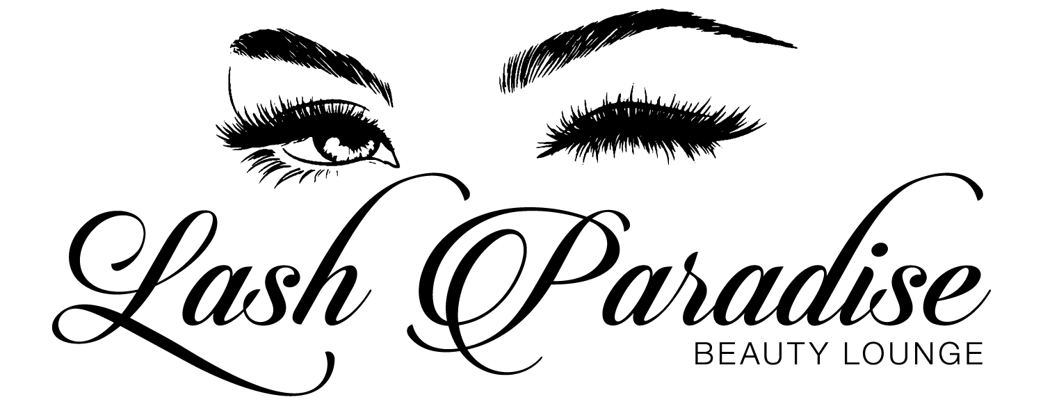
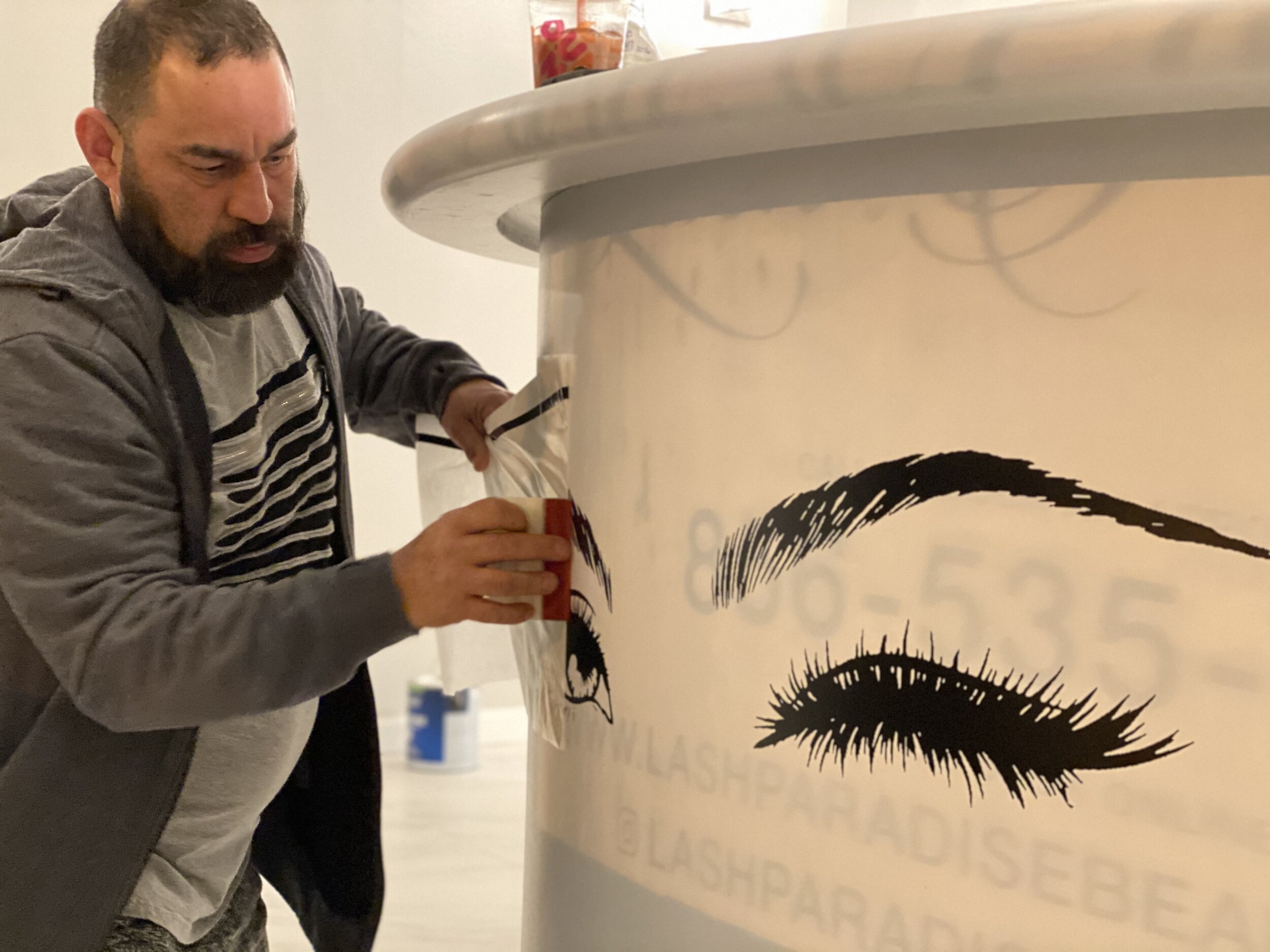
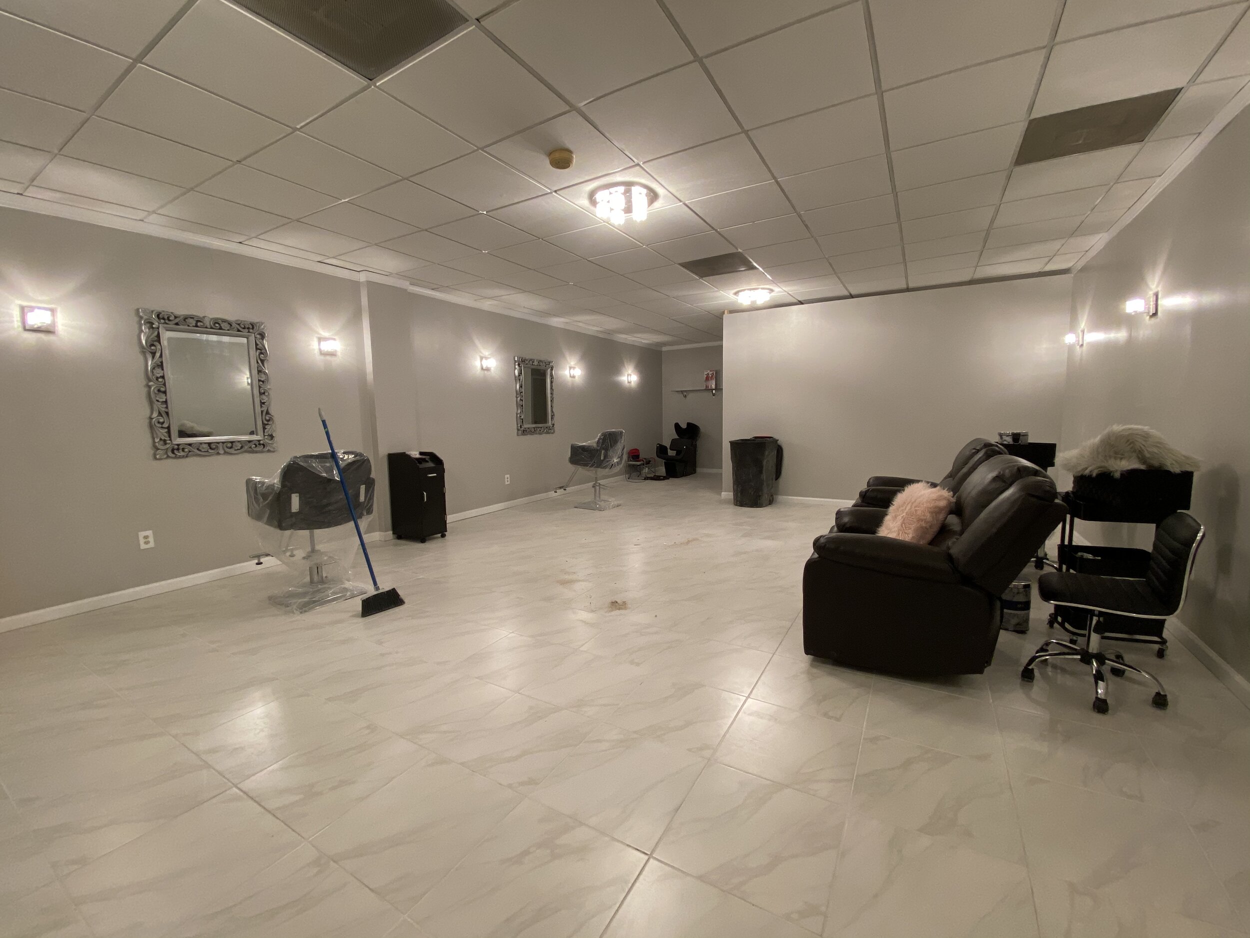
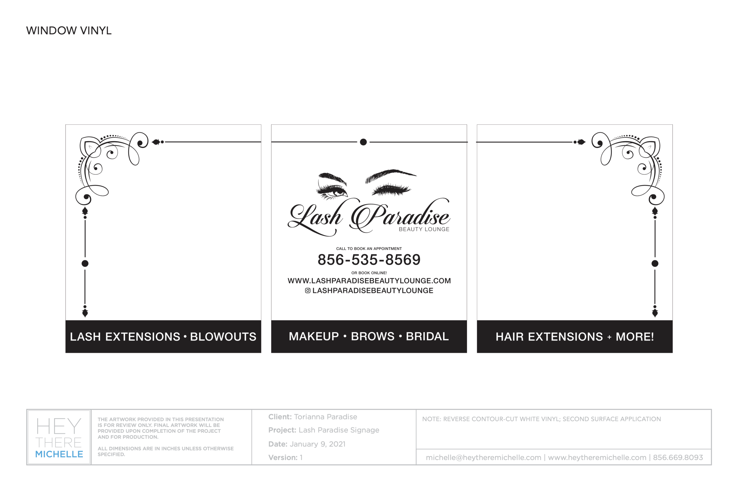
During the pandemic, she came to my boyfriend and me and announced she found a space and was going to rent it for her own salon. She wanted me to design the logo and signage and my boyfriend would take care of getting the collateral fabricated and he would install.

I was trying to wait until the salon’s grand opening before posting this blog, but the grand opening was also supposed to be a couple of months ago. The salon is open and operating and books fast! Contact and location info will be at the bottom of this post.

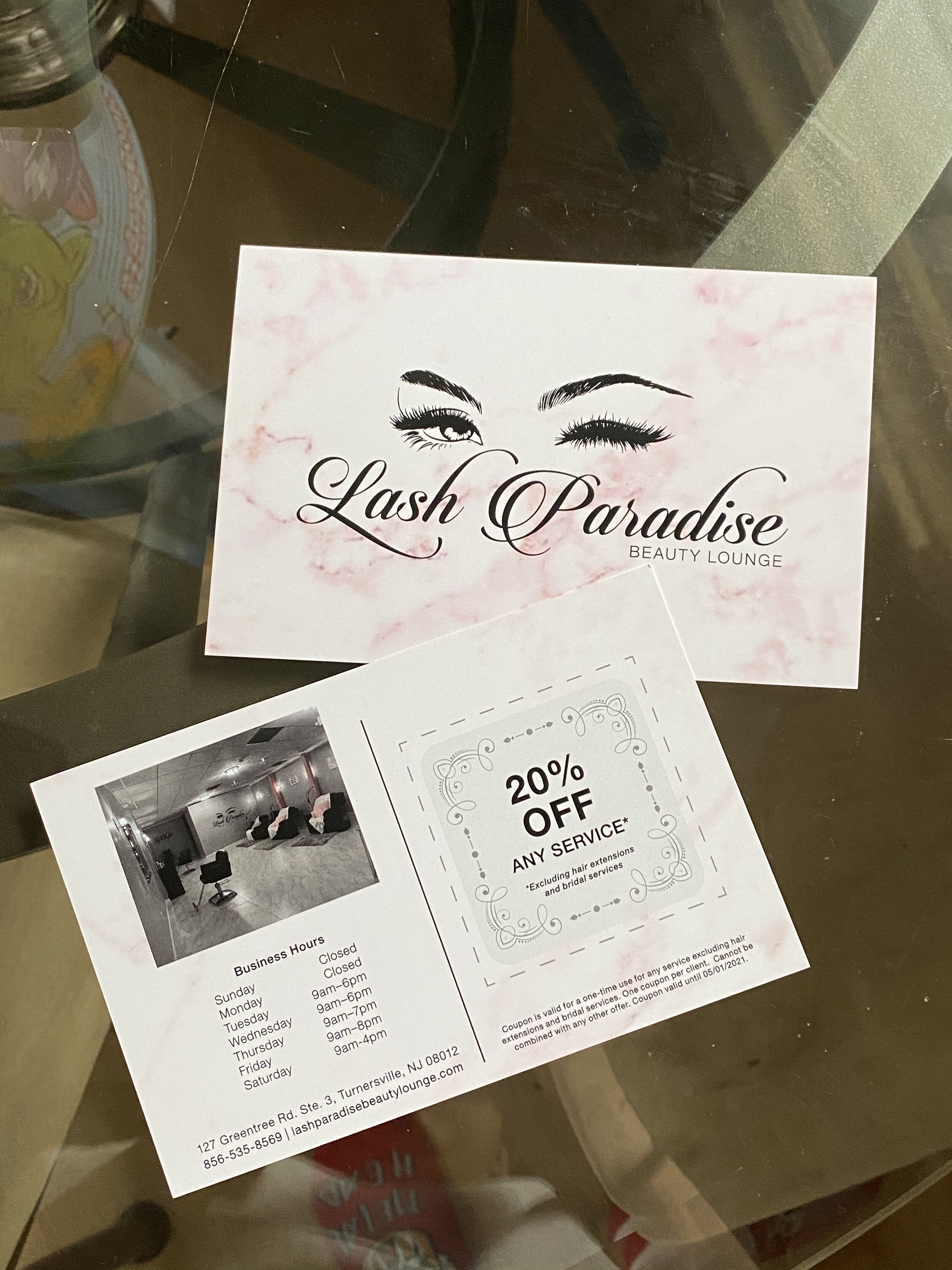
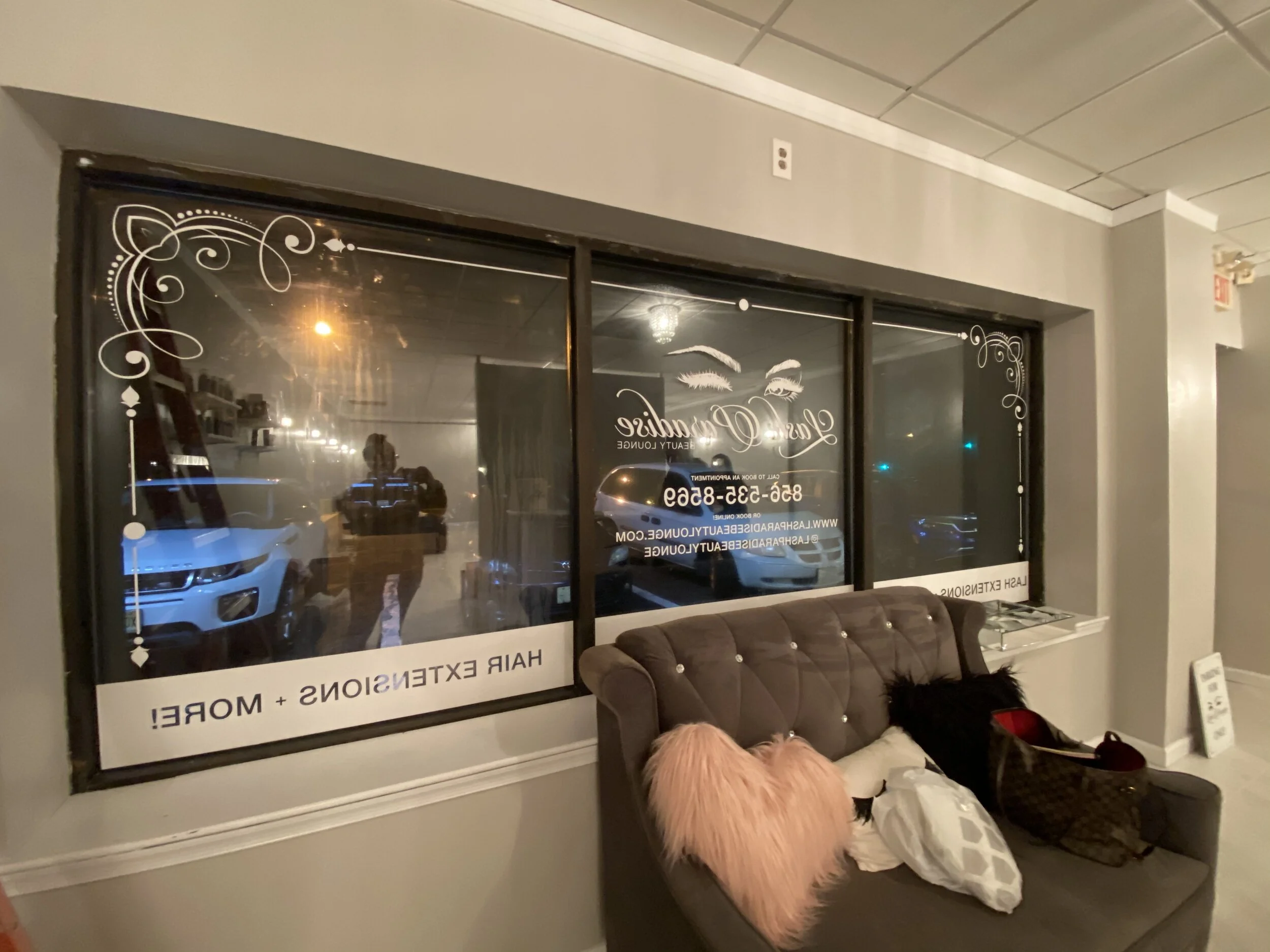
Lash Paradise Beauty Lounge, located at 127 Greentree Rd Ste 3, Blackwood, NJ 08012, is not too far from the on-ramp to 42 N (North-South Freeway) with easy access to Deptford shopping areas, 295 N and S, and the Walt Whitman and Ben Franklin bridges to Philadelphia. It’s also close to the AC Expressway, linking Philadelphia to Atlantic City, and Rt 322 for a more scenic route to the southern shore points.

You can call the salon at (856) 535-8569 or visit their website at https://lashparadisebeautylounge.com/home to book an appointment.

Logo: LAR Services

When you’re a graphic designer, everyone you know will usually come to you for any “creative work” they need. Sometimes it’s dumb, other times it’s fun. This is one of those times where it was fun.

My boyfriend, Luis, during the initial quarantine period last year, experienced a lay off from his job. While home, he decided he wanted to invest in something that would eventually pay for itself: a tractor.

One day, he says to me, “guess what I just bought!” and shows me a picture of what I call a “big, orange bug”. He bought this beautiful, bright pumpkin orange kubota (the actual color is “Kubota Orange”—so innovative, so creative) tractor as well as some accessories for it. That entire week, he rode around in it, built a new shed for his pieces, cleared a section of his yard so we could start a garden, and started telling his friends and family to spread the word. It was decided using this tractor would be a side hustle for him, which was good for some sort of income while unemployed, even if patchy.

With this decision, he wanted to make it a little more professional. Together, we worked on a logo, and put that logo on business cards, signs, and magnets he put on his truck.

His vision was to incorporate both his new toy and the color. He also made it clear that he did not want the tractor to be orange, because he was afraid it wouldn’t stand out enough.

We went through a few (read: several) ideas at first. None of them really spoke to him or how he felt his new venture should be portrayed to a tee, but he did have some partial feelings to a couple. He also insisted the word “backhoe” be used so people had a specific idea of what services he actually offered and that he was not just a handyman.

Although I no longer have these printouts we pinned up to show, I still have the digital version. He circled a couple from this initial round and we took it from there. What we came up with was kind of simple, but was exactly what Luis was looking for.

We kept the tractor black like the “LAR”, but added an orange ring behind it. The orange signified the color of the tractor, the roundness of a circle reflected upon Luis’ well-rounded nature in both his personality and work (despite specifically using the word “backhoe” to identify what he did) and drew attention to the tractor. The words “Backhoe Services” are in a beautiful charcoal gray to avoid too much black logo, and to let the “LAR” (Luis’ initials) and the tractor stand out, thus becoming the key identifiers in the logo.

Copy styles and choices in black and white.

Copy styles and choices in black and white.

Color version of the logo: vertical, horizontal, icon, and logotype.

Luis’ first time using the tractor to try and dig up the surface of the yard before tilling for us to start our garden.

Once Luis signed off on the logo, we went to work making other things for him to get started with: business cards (home-printed to see how it goes), a sign for his garage, and a set of magnets for his truck.

With the signs and the business card, Luis wanted to take it a step further and add on key words that let people know what he can do with his tractor: auger, backhoe, brush hog, and loader—attachments he has for the tractor to get different things done. Over the winter with each snowfall, he was able to go plow for different local businesses, as people began to refer him via WOM (word of mouth).

As things begin to pick up for him, and he feels like he can really make a living with it, he will start to look into making it into an LLC, get real business cards printed, and maybe even find an office space. But for now, we’re just working simply and enjoying his new toy.

I had asked Luis to let me take photos of him holding his business cards for months at this point; by time he was able to let me do it, he already handed out all the good copies of his cards and only had the mistakes left, hence the banding on the one card.

The sign hangs above the garage doors that house the bug.

One of the magnets seated on the door of Luis’ truck.

One of the magnets seated on the door of Luis’ truck.

For anyone in the South Jersey area (for now) looking for work to be done by Luis and his orange tractor, feel free to call the number on the sign, or email the address shown on his card.

Top Hops Essex Crossing

Concept rendering I did in Photoshop.

Concept rendering I did in Photoshop.

I like beer. Not like, to the level of Supreme Justice Brett Kavanaugh, but enough to be excited about a job that involves beer. No, I didn’t get to drink any, but I got to look at it and think like it.

What does that even mean?

Well, it means think like your client. Not in the sense of not knowing how to arrange type and making things pop to the point it looks like you made it in MS Paint, but rather about the business. What about them? What do they do? Why do people love them? What do they look like? What do they want to look like? Ask questions because with questions come answers and with answers come ideas.

Creativity wasn’t at full blast here as some of the implementations were taken from their other locations—to sort of, y’know, tie it all together. Color palettes, sign styles, etc.

via @Top_Hops on Instagram

via @Top_Hops on Instagram

What makes things fun, though, is being able to pull other people into the mix. In this project, we needed (2) hanging bottle signs, (2) chalkboards, one counter stencil and a whole lot of Photoshop work. The bottle signs and counter stencil was easy—send it to the shop. But what do we do with the chalkboards? We could ask the shop to make them, OR…

We can employ a woodworker who makes out-of-this-world things like furniture and décor from scrap wood he sources from various places. I had brought Jeff Miller, a former classmate of mine from our undergrad days and a fellow South Jerseyan, on board for a project we did for Adidas in their new office space in NYC—he built four styles of frames for us for that job, about twenty or so in total (it may have been more), and they were phenomenal. I knew he’d blow this one out of the park, too. I convinced my boss to let him do it and yup!

He did it again.

All-in-all, this job was a success and the clients were really happy with the outcome.

Client: Top Hops Brewing Company (via drive21)

Project: Top Hops Essex Crossing Market

Fabricators: XDFOUR; Jeff Miller

Undertone @ 1 WTC

Quote with mustache layout for the Dalí room.

Quote with mustache layout for the Dalí room.

What do Georgia O’Keeffe, Banksy and Dalí have in common? Other than being artists, nothing. They’re all from different time periods and have vastly different styles of creating art. However, the folks at Undertone loved that about these artists and wanted to bring their flavor together in this new soup called “our new office”.

The information I got was simple: a floor plan with room labels, quotes that were to be used and the artists’ names, and ideas of what imagery was desired. Basic, but helpful. The rest was up to my team and me…my team being just the team lead and me in the beginning, then the other two guys later on during install. Over our holiday break, my team lead and I sent files back and forth—I did the research and laid everything out, he was the second set of eyes that looked over everything. Between the two of us, all of the window vinyl (less than 100 panels) was in production in two days with client approval.

Quote layout designed by me; a stencil was applied to the wall to ensure straight lines and proper alignment

Quote layout designed by me; a stencil was applied to the wall to ensure straight lines and proper alignment

As the month went by, more research, back and forth (at a minimum) and product sourcing went by. Where does one find a real bull’s skull? eBay, of course! And how about the gradient wallpaper behind it? Make the gradient, we’ll print it in our shop!

If there’s one thing I learned from this job, it’s that Annie Leibovitz does not mass print any of her photographs. How bougie.

Where do the picture frames come from that go around the images you can get? The shop! Nope, shop won’t make them in the short amount of time you have, so then what? Buy them! From an online frame store! Luckily a coworker had just bought from said e-store for another job and was happy with the outcome.

unnamed.jpg

How about that pantry wall? Design the type for the quote and make a stencil!

What about the wall decals? eBay! No! MAKE THEM IN THE SHOP—production costs are lower than sourcing and purchasing each one. And that mirrored bear as homage to Jeff Koons? Make it; just needs a little DS VHB on the back, maybe some silicone.

This is probably one of the more fun jobs I got put on and the view from Undertone’s office on the 77th floor is amazing. Wouldn’t mind doing something like this again.

ADA Signage - Learning and Applying Knowledge and Skills

Photo credit: Myself—I used my Samsung Galaxy S3 to photograph my own hand manually inserting braille rasters into holes drilled by machine into a 1/4” thick piece of P95 acrylic.

Photo credit: Myself—I used my Samsung Galaxy S3 to photograph my own hand manually inserting braille rasters into holes drilled by machine into a 1/4” thick piece of P95 acrylic.

When I took the job at Urban Sign in September of 2013, I was very much under the impression that I would be just their in-house graphic designer. What unfolded during the five years I was employed there was much more than pushing around pixels on the screen.

I started to learn more and with each new thing I learned, I was also given new responsibilities and eventually I was able to run production by myself. One of the subjects I had to learn about (and more or less teach myself) was interior ADA: how to design it, how to make it and how to install it.

So what goes into a standard ADA sign for, say, a restroom? More than you think!

It starts with the verbiage. What does the sign need to say? Bathroom? Ladies? Restroom? From there, a layout is designed. Restroom (or any other) signs can be any shape or size, so as long as your isotype (icons) sit in a space that is a minimum of 6” tall (no minimum height for the isotype themselves), your copy is no smaller than ⅝” high but smaller than 2”, the space between your copy and braille, and around the braille is no more or less than ⅜”, the braille rasters protrude from the sign no more or less than 1/32” and are domed, and the colors on the sign are contrasting enough that anyone from any distance can tell them apart. Oh, and the braille on the sign MUST follow the copy and be grade 2.

Did I lose you yet?

The aforementioned specs are not guidelines, but rather lawful standards written in the ADA (American Disabilities Act) manual of design standards. Although it’s rare for someone from ADA to walk into your establishment and whip out a ruler to measure your braille, if you’re found to be in violation of ADA code, you face up to $75,000 for your first offense, with each following offense looking at $150,000 a pop. So before you send out that ADA sign for install, make sure it follows all the proper code.

A sign I laid out and assembled for a space at Drexel University. This sign was fabricated out of bent aluminum, 1/32” thick non-glare acrylic material, clear raster braille and screen printed copy.

A sign I laid out and assembled for a space at Drexel University. This sign was fabricated out of bent aluminum, 1/32” thick non-glare acrylic material, clear raster braille and screen printed copy.

I was HORRIFIED when I moved on to my next job at drive21 and, while poking through previous job folders on their drive, found that more than half of the jobs they worked on had violations all over the ADA signage. Most of them having come from design firms or the clients themselves and no one on staff knowing any better to correct any of it. I made it my own personal mission to make sure that future jobs would not suffer so as long as I could help it. The folks I worked with closely at Cadwell Signs up in Holliston, MA, during my time at drive, dubbed me the ADA Kween because I was able to have conversations about what we were working on, not just listen and agree. I was able to teach one of the designers what I knew about ADA and on every call after that, I was greeted with “The Kween as arrived.”

A sign I made from photopolymer. Photopolymer allows you to process signs with all raised elements (isotype, copy and braille) at the same time. The entire sign is painted its base color, which in this photo is a charcoal gray, and the isotype and c…

A sign I made from photopolymer. Photopolymer allows you to process signs with all raised elements (isotype, copy and braille) at the same time. The entire sign is painted its base color, which in this photo is a charcoal gray, and the isotype and copy are tipped (sometimes hot stamped) the contrasting color, which here is white.

I’m not an expert. In fact, there’s SO much to know, learn, understand and apply that I could still take a 101 course and learn 2x more than what I already know. Each city, state and country, even, has their own proprietary set of laws (code) that govern how ADA is to be manufactured. California is notorious for stricter laws and codes on everything, so I wish drive the best of luck when they finally make their west coast expansion next year.

The craziness of it all is how fine some of the details are and how serious some places are with…well…everything. From the materials (do you want to use Nova or Jet?), to the cost (what do you want to spend?), to what it needs to look like (does it need to be photoluminescent? Are you using acrylic? Will you dome the braille by hand or rely on paint coats?) to methods of production (are you using the Raster® Braille method or will the braille be left behind in washout?), there are always a HUNDRED AND ONE questions to ask when making these signs.

I could go on with this post, but as I noted before, there is SO much information when it comes to ADA, that it’s impossible to keep it all contained in one blog post. But if you want to read some serious stuff on ADA, visit the ADA.gov website.