Top Hops Essex Crossing

Concept rendering I did in Photoshop.

Concept rendering I did in Photoshop.

I like beer. Not like, to the level of Supreme Justice Brett Kavanaugh, but enough to be excited about a job that involves beer. No, I didn’t get to drink any, but I got to look at it and think like it.

What does that even mean?

Well, it means think like your client. Not in the sense of not knowing how to arrange type and making things pop to the point it looks like you made it in MS Paint, but rather about the business. What about them? What do they do? Why do people love them? What do they look like? What do they want to look like? Ask questions because with questions come answers and with answers come ideas.

Creativity wasn’t at full blast here as some of the implementations were taken from their other locations—to sort of, y’know, tie it all together. Color palettes, sign styles, etc.

via @Top_Hops on Instagram

via @Top_Hops on Instagram

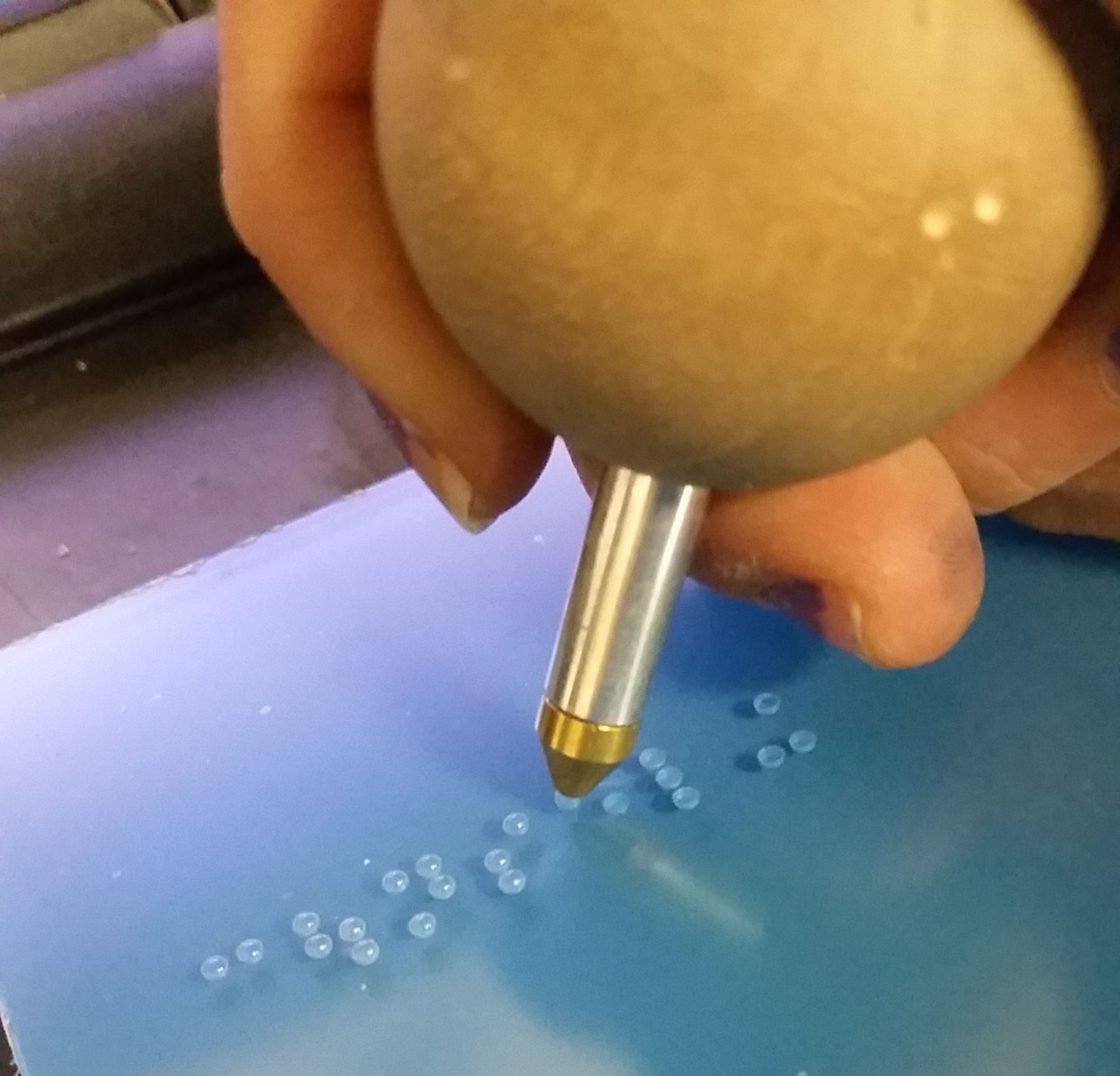
What makes things fun, though, is being able to pull other people into the mix. In this project, we needed (2) hanging bottle signs, (2) chalkboards, one counter stencil and a whole lot of Photoshop work. The bottle signs and counter stencil was easy—send it to the shop. But what do we do with the chalkboards? We could ask the shop to make them, OR…

We can employ a woodworker who makes out-of-this-world things like furniture and décor from scrap wood he sources from various places. I had brought Jeff Miller, a former classmate of mine from our undergrad days and a fellow South Jerseyan, on board for a project we did for Adidas in their new office space in NYC—he built four styles of frames for us for that job, about twenty or so in total (it may have been more), and they were phenomenal. I knew he’d blow this one out of the park, too. I convinced my boss to let him do it and yup!

He did it again.

All-in-all, this job was a success and the clients were really happy with the outcome.

Client: Top Hops Brewing Company (via drive21)

Project: Top Hops Essex Crossing Market

Fabricators: XDFOUR; Jeff Miller

ADA Signage - Learning and Applying Knowledge and Skills

Photo credit: Myself—I used my Samsung Galaxy S3 to photograph my own hand manually inserting braille rasters into holes drilled by machine into a 1/4” thick piece of P95 acrylic.

Photo credit: Myself—I used my Samsung Galaxy S3 to photograph my own hand manually inserting braille rasters into holes drilled by machine into a 1/4” thick piece of P95 acrylic.

When I took the job at Urban Sign in September of 2013, I was very much under the impression that I would be just their in-house graphic designer. What unfolded during the five years I was employed there was much more than pushing around pixels on the screen.

I started to learn more and with each new thing I learned, I was also given new responsibilities and eventually I was able to run production by myself. One of the subjects I had to learn about (and more or less teach myself) was interior ADA: how to design it, how to make it and how to install it.

So what goes into a standard ADA sign for, say, a restroom? More than you think!

It starts with the verbiage. What does the sign need to say? Bathroom? Ladies? Restroom? From there, a layout is designed. Restroom (or any other) signs can be any shape or size, so as long as your isotype (icons) sit in a space that is a minimum of 6” tall (no minimum height for the isotype themselves), your copy is no smaller than ⅝” high but smaller than 2”, the space between your copy and braille, and around the braille is no more or less than ⅜”, the braille rasters protrude from the sign no more or less than 1/32” and are domed, and the colors on the sign are contrasting enough that anyone from any distance can tell them apart. Oh, and the braille on the sign MUST follow the copy and be grade 2.

Did I lose you yet?

The aforementioned specs are not guidelines, but rather lawful standards written in the ADA (American Disabilities Act) manual of design standards. Although it’s rare for someone from ADA to walk into your establishment and whip out a ruler to measure your braille, if you’re found to be in violation of ADA code, you face up to $75,000 for your first offense, with each following offense looking at $150,000 a pop. So before you send out that ADA sign for install, make sure it follows all the proper code.

A sign I laid out and assembled for a space at Drexel University. This sign was fabricated out of bent aluminum, 1/32” thick non-glare acrylic material, clear raster braille and screen printed copy.

A sign I laid out and assembled for a space at Drexel University. This sign was fabricated out of bent aluminum, 1/32” thick non-glare acrylic material, clear raster braille and screen printed copy.

I was HORRIFIED when I moved on to my next job at drive21 and, while poking through previous job folders on their drive, found that more than half of the jobs they worked on had violations all over the ADA signage. Most of them having come from design firms or the clients themselves and no one on staff knowing any better to correct any of it. I made it my own personal mission to make sure that future jobs would not suffer so as long as I could help it. The folks I worked with closely at Cadwell Signs up in Holliston, MA, during my time at drive, dubbed me the ADA Kween because I was able to have conversations about what we were working on, not just listen and agree. I was able to teach one of the designers what I knew about ADA and on every call after that, I was greeted with “The Kween as arrived.”

A sign I made from photopolymer. Photopolymer allows you to process signs with all raised elements (isotype, copy and braille) at the same time. The entire sign is painted its base color, which in this photo is a charcoal gray, and the isotype and c…

A sign I made from photopolymer. Photopolymer allows you to process signs with all raised elements (isotype, copy and braille) at the same time. The entire sign is painted its base color, which in this photo is a charcoal gray, and the isotype and copy are tipped (sometimes hot stamped) the contrasting color, which here is white.

I’m not an expert. In fact, there’s SO much to know, learn, understand and apply that I could still take a 101 course and learn 2x more than what I already know. Each city, state and country, even, has their own proprietary set of laws (code) that govern how ADA is to be manufactured. California is notorious for stricter laws and codes on everything, so I wish drive the best of luck when they finally make their west coast expansion next year.

The craziness of it all is how fine some of the details are and how serious some places are with…well…everything. From the materials (do you want to use Nova or Jet?), to the cost (what do you want to spend?), to what it needs to look like (does it need to be photoluminescent? Are you using acrylic? Will you dome the braille by hand or rely on paint coats?) to methods of production (are you using the Raster® Braille method or will the braille be left behind in washout?), there are always a HUNDRED AND ONE questions to ask when making these signs.

I could go on with this post, but as I noted before, there is SO much information when it comes to ADA, that it’s impossible to keep it all contained in one blog post. But if you want to read some serious stuff on ADA, visit the ADA.gov website.

Wine Bar

TreeTavern-WineBar-01.png

While working at the sign shop, I met a woman who was an important part of the company, although she was not an employee, manager or co-owner. Rather, she was a family friend who helped with the finance stuff and would occasionally bring the shop some work.

One of the projects she brought along was for us to build a custom over-the-door sign for the wine bar in a restaurant owned by a friend of hers.

She spoke with my boss, then came to me with her idea, giving me full rights to creativity. This is what I came up with, approval soon following.

The idea was to take the top portion of a barrel (imagine taking a large wine barrel and cutting just below the top band) and turning it into a custom sign with 3-D elements such as laser- and router-cut and painted acrylic letters and shapes affixed to the surface with studs and adhesive.

Unfortunately, the plan fell through, so we were never able to bring this sign to life. It sits memorialized in its 2-D state in my portfolio.

.

This was designed while I was employed at Urban Sign & Crane, Inc.