What was interesting about the whole thing is she wanted the Jesus figure to be illustrated and in an anime style. I don’t have any aversions to anime-style. In fact, I LOVE the anime style of illustration (I like manga better, but alas), but for starters I’m not Japanese. There’s no rule that says non-Japanese artists shouldn’t do Japanese-style art, but when it’s not created by a Japanese artist, it sort of loses its magic, yanno?
Read moreEnailcouture.com Reimagined
For this assignment, I chose a website because the first thing that popped into my head was my first experience with Enailcouture.com. A few months prior, I bit the bullet and decided to make a purchase from there. I heard really great things about the products sold, and since I’m always down to try new stuff related to nails, I went ahead and ordered two types of full-cover gel nail tips and the gel “glue” to go with it. The whole purchase process took me ONE HOUR. I wasn’t browsing the site to look at what he had, I went there knowing what I wanted, and it took me a whole hour out of my day just to find the items and figure out the checkout process.
Read moreLogo: Freakin' Rican Kitchen
Have a need for birra tacos or slammin’ loaded nachos? Check out the delicious work I did for Freakin’ Rican Kitchen in South Jersey. Links for connecting and ordering are within the post!
Read moreEGD: Lash Paradise Beauty Lounge
Although I don’t wildly spend money on things I can’t afford, I’d like to say I have expensive taste. I enjoy looking at clothes, buying prestige brands when I shop for makeup, and not settling for store brand things when I know I can get the national brand names. I’m not great at saving (though I try), and I dunno… I wanna be fancy, I guess.
My boyfriend’s soon-to-be daughter-in-law, Torianna, has her cosmetology license and has been working doing hair (blowouts, specifically) and lashes for years at this point. She started her own LLC doing lashes and cleverly named it after herself: Lash Paradise. (Torianna’s last name is Paradise—cool, right?) She started by working out of her home in a cute little room in the house she and her two children shared with her mother and stepfather. There were cute and bougie lash-themed decorations, a nice bed lined with that crinkly paper you find in the doctor’s office on a roll, a small rolly-stool for the tech to sit while she’s working, and a nice little organizer on the side with all of her tools and supplies.
Over the years, she’s built up her clientele, and as a fellow woman with expensive taste, she also had dreams of having a high-end salon.
During the pandemic, she came to my boyfriend and me and announced she found a space and was going to rent it for her own salon. She wanted me to design the logo and signage and my boyfriend would take care of getting the collateral fabricated and he would install.
I was trying to wait until the salon’s grand opening before posting this blog, but the grand opening was also supposed to be a couple of months ago. The salon is open and operating and books fast! Contact and location info will be at the bottom of this post.


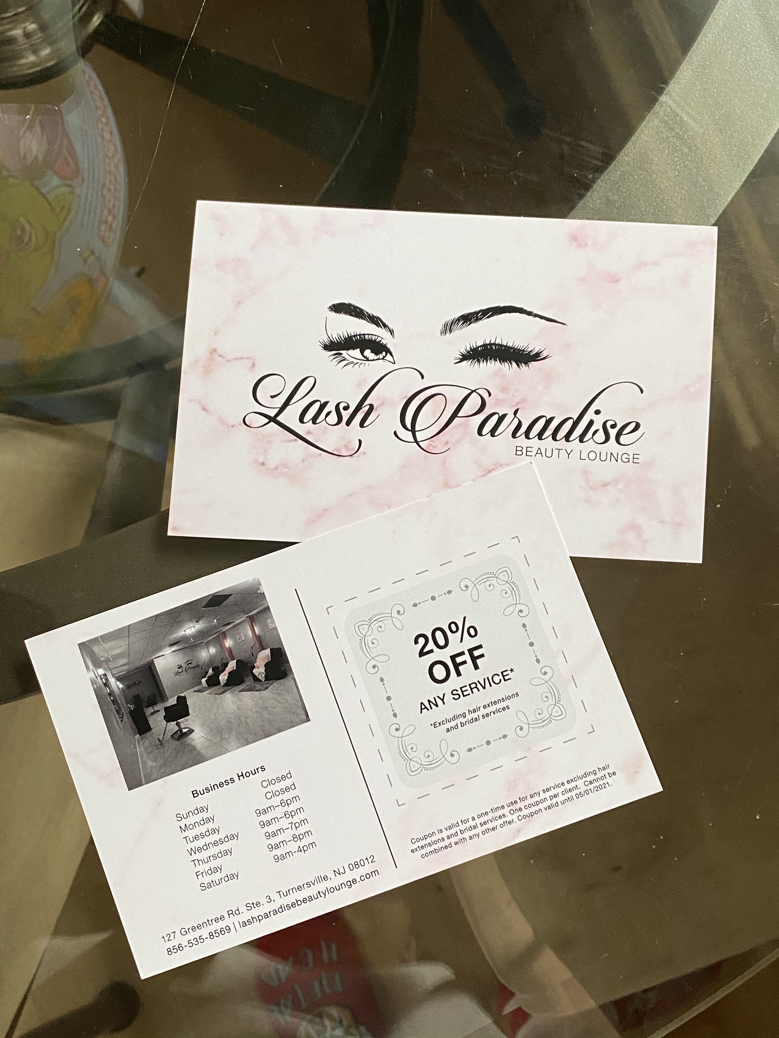


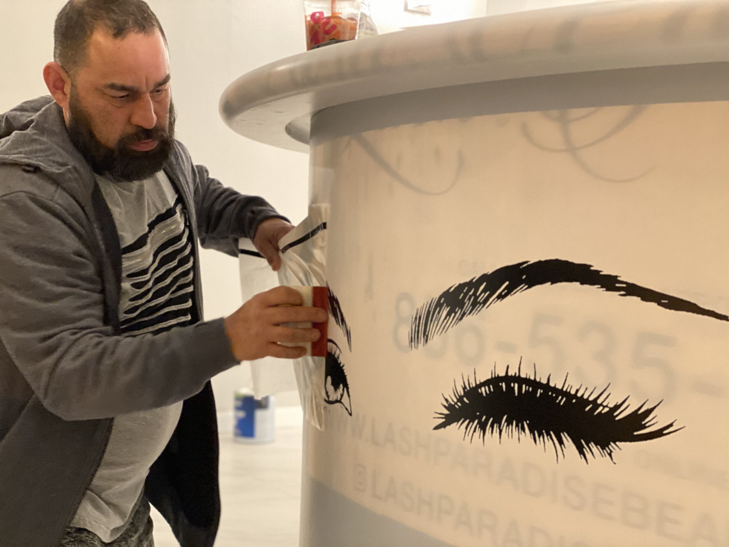


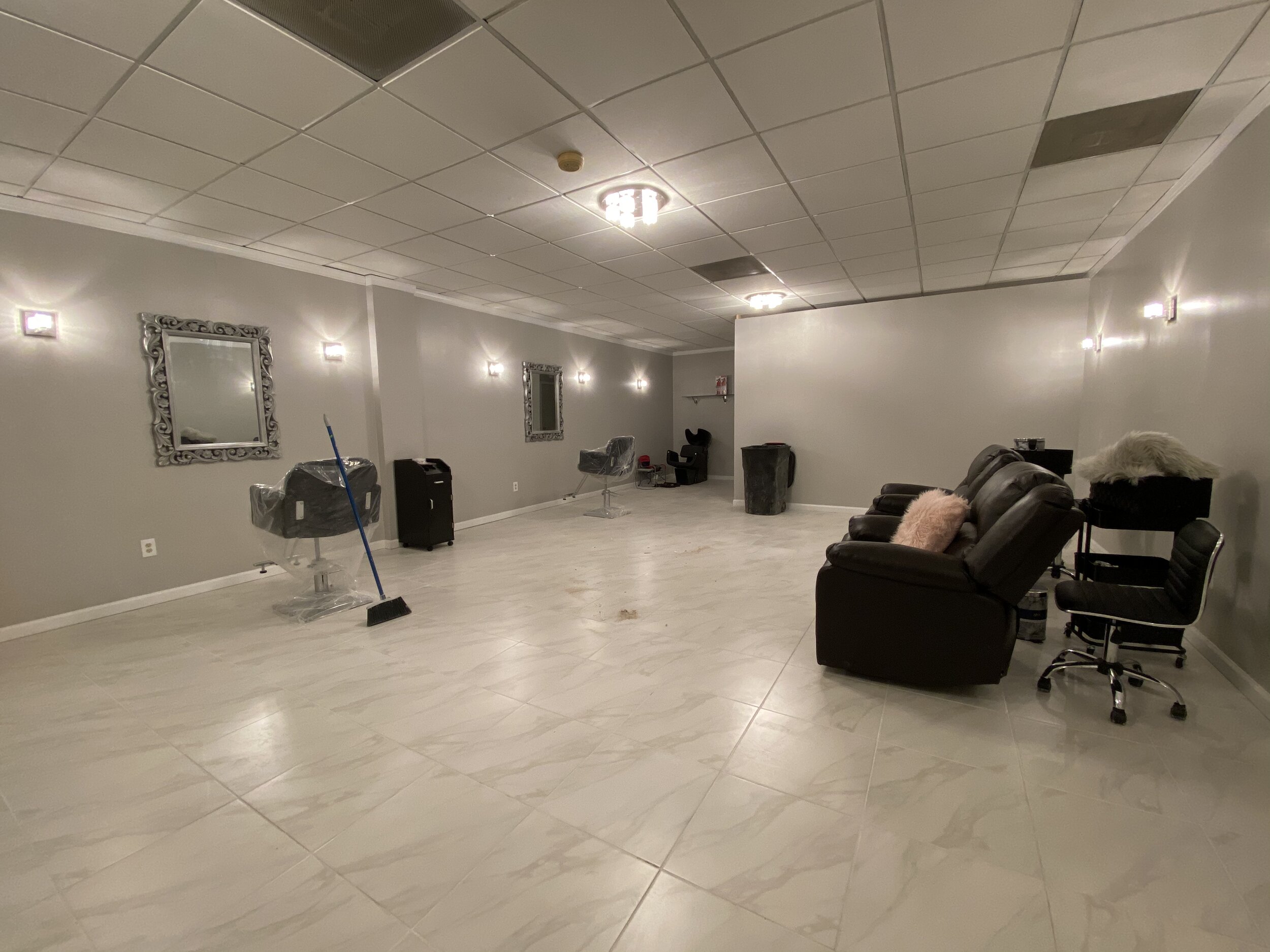

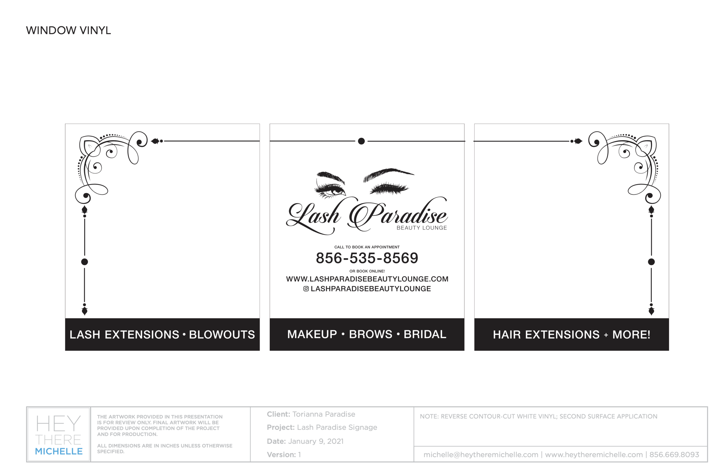
Lash Paradise Beauty Lounge, located at 127 Greentree Rd Ste 3, Blackwood, NJ 08012, is not too far from the on-ramp to 42 N (North-South Freeway) with easy access to Deptford shopping areas, 295 N and S, and the Walt Whitman and Ben Franklin bridges to Philadelphia. It’s also close to the AC Expressway, linking Philadelphia to Atlantic City, and Rt 322 for a more scenic route to the southern shore points.
You can call the salon at (856) 535-8569 or visit their website at https://lashparadisebeautylounge.com/home to book an appointment.
Logo: LAR Services
When you’re a graphic designer, everyone you know will usually come to you for any “creative work” they need. Sometimes it’s dumb, other times it’s fun. This is one of those times where it was fun.
My boyfriend, Luis, during the initial quarantine period last year, experienced a lay off from his job. While home, he decided he wanted to invest in something that would eventually pay for itself: a tractor.
One day, he says to me, “guess what I just bought!” and shows me a picture of what I call a “big, orange bug”. He bought this beautiful, bright pumpkin orange kubota (the actual color is “Kubota Orange”—so innovative, so creative) tractor as well as some accessories for it. That entire week, he rode around in it, built a new shed for his pieces, cleared a section of his yard so we could start a garden, and started telling his friends and family to spread the word. It was decided using this tractor would be a side hustle for him, which was good for some sort of income while unemployed, even if patchy.
With this decision, he wanted to make it a little more professional. Together, we worked on a logo, and put that logo on business cards, signs, and magnets he put on his truck.
His vision was to incorporate both his new toy and the color. He also made it clear that he did not want the tractor to be orange, because he was afraid it wouldn’t stand out enough.
We went through a few (read: several) ideas at first. None of them really spoke to him or how he felt his new venture should be portrayed to a tee, but he did have some partial feelings to a couple. He also insisted the word “backhoe” be used so people had a specific idea of what services he actually offered and that he was not just a handyman.
Although I no longer have these printouts we pinned up to show, I still have the digital version. He circled a couple from this initial round and we took it from there. What we came up with was kind of simple, but was exactly what Luis was looking for.
We kept the tractor black like the “LAR”, but added an orange ring behind it. The orange signified the color of the tractor, the roundness of a circle reflected upon Luis’ well-rounded nature in both his personality and work (despite specifically using the word “backhoe” to identify what he did) and drew attention to the tractor. The words “Backhoe Services” are in a beautiful charcoal gray to avoid too much black logo, and to let the “LAR” (Luis’ initials) and the tractor stand out, thus becoming the key identifiers in the logo.
Copy styles and choices in black and white.
Color version of the logo: vertical, horizontal, icon, and logotype.
Luis’ first time using the tractor to try and dig up the surface of the yard before tilling for us to start our garden.
Once Luis signed off on the logo, we went to work making other things for him to get started with: business cards (home-printed to see how it goes), a sign for his garage, and a set of magnets for his truck.
With the signs and the business card, Luis wanted to take it a step further and add on key words that let people know what he can do with his tractor: auger, backhoe, brush hog, and loader—attachments he has for the tractor to get different things done. Over the winter with each snowfall, he was able to go plow for different local businesses, as people began to refer him via WOM (word of mouth).
As things begin to pick up for him, and he feels like he can really make a living with it, he will start to look into making it into an LLC, get real business cards printed, and maybe even find an office space. But for now, we’re just working simply and enjoying his new toy.
I had asked Luis to let me take photos of him holding his business cards for months at this point; by time he was able to let me do it, he already handed out all the good copies of his cards and only had the mistakes left, hence the banding on the one card.
The sign hangs above the garage doors that house the bug.
One of the magnets seated on the door of Luis’ truck.
For anyone in the South Jersey area (for now) looking for work to be done by Luis and his orange tractor, feel free to call the number on the sign, or email the address shown on his card.
